
Comment identifier les différentes tailles des lettres A et K pour le type CERES
There are in all 3 sizes of letters for the mint of Paris (letter A): small, normal and high. However, it is possible that one names small by: very small; normal will also be named medium. This is due to the fact that the punches used to mark the mint letter on the die, are more or less small. For example it will be very small if the letter is engraved with a punch used for cents, on a corner for a 2 francs. The final visual will give the impression of having a ''very small'' letter. I also think that name is given to help people understand what we are talking about. Because people who referenced these variants knew well that it is very difficult to see the difference between normal and small. Because sometimes even the punch '' normal '' is already itself small. One way to say '' imagine a tiny letter ''.
Let's go straight into the problem: how do you know if it's a small or normal letter? Or still normal or high? If you have no point of comparison, it's complicated. What can already help you is to imagine the other modules using these punches. I list here the punches used by module:
2 centimes:
- small A = punch of 1 centime.
- medium A = punch of 2 centimes. (also named ''A normal'')
- high A = punch of 5 centimes.
5 centimes:
small A = punch of 1 centime (also named ''very small A'')
medium A = punch of 5 centimes (or A normal)
10 centimes:
small A = punch of 1 centime? (also named ''very small A'')
medium A = punch of 10 centimes?
high A = punch of 10 centimes?
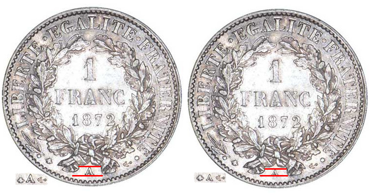
1 franc:
small A = punch of 50 centimes.
medium A = punch of 1 franc (also named ''A normal'')
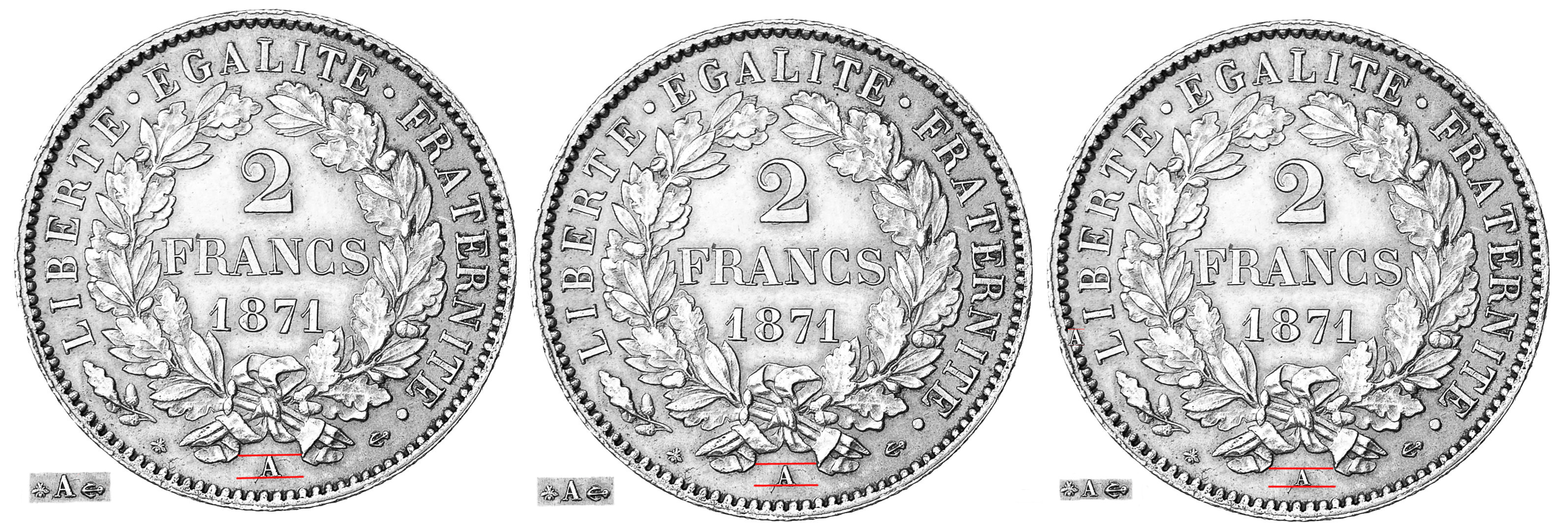
2 francs:
small A = punch of 1 centime (also named ''A tiny'')
medium A = punch of 2 francs.
high = punch of 5 francs?
5 francs:
small A = punch of 2 francs.
medium A = punch of 5 francs.
I noted each time, even if it seems repetitive, the other names given. I also noticed some punches with ''? ' because in my opinion, we can not be totally sure of the punch used. Because of: the quality of striking that makes a letter seem a little smaller because the top has not printed well. And also because for the 10 cents, A medium and large are they two punches used only for the 10 cents or they served for the franc 1 when this letter is high? Difficult to determine, the difference in size is minimal. For the 5 francs, since the 10 francs of this time does not exist and the medium A is already bigger than the punch of 2 francs ... I presume that the high A is a second punch for the 5 francs .
IMPORTANT, ALL THIS IS EXACTLY SIMILAR FOR THE MIN OF BORDEAUX. DO NOT NEED TO NOTE THE SAME THING TWICE.
Now, let's see the most complicated: I show you below the letter sizes with lines that serve to see the spacing and not the position of the letter! Because as they are punches (hand-printed so), their position changes according to the dies. So how to do? Well, I thought of one thing that does not change size: the privy marks. I think I am the first or one of the first to use this technique. To the left of each coin in the boards below, I have copied the sizes of privy marks near to the letters so you can compare the sizes. And it becomes simpler.
I specify, before going to the boards below, that I realized a total montage, the sizes of small or big letters are realized by a photo software. I could not take pictures of each type for a reason: most pictures of types of size are findable but often the rarest are in a pitiful state and that would complicate a correct visualization. So you can more easily visualize with this montage. The rendering is extremely true to reality do not worry. The other advantage is that I show you first 3 times the same coin with 3 types of sizes of different A (or 2 if the type only has 2 known sizes) that will force you to look at the important points to determine the size. Sometimes a stain or patina can deceive your eyes and here it will not be the case. Then, still below is a board with the lines showing the deviations and also the privy marks next to the letters.
Finally, one last point that I chose to separate into a single paragraph: the small A's, the tiny ones (as for the 2 francs which is the 1 cent) are so small that the A's do not have any more '' holes '' in their upper part, giving the impression of a solid triangle with two small legs. For the K it looks like a square with two slots.
Size tables with explanations:
(from left to right, from the largest to the smallest)
2 centimes:
.jpg?1547143629376)
Illustration from a coin sold by Numiscorner, link to their website and sale:
.jpg?1547140083638)
5 centimes
.%5B2%5D.jpg?1547143654040)
Illustration from a coin sold by Numiscorner, link to their website and sale:
.jpg?1547141297223)
10 centimes

Montage from the same 5 centimes, copies of 10 centimes whose photos are available were too poor quality.

1 franc
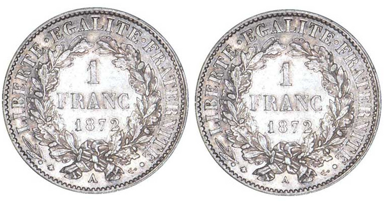
Illustration from a coin sold by Patrick Guillard, link to his website and sale:
http://patrickguillard.com/product/30910
2 francs
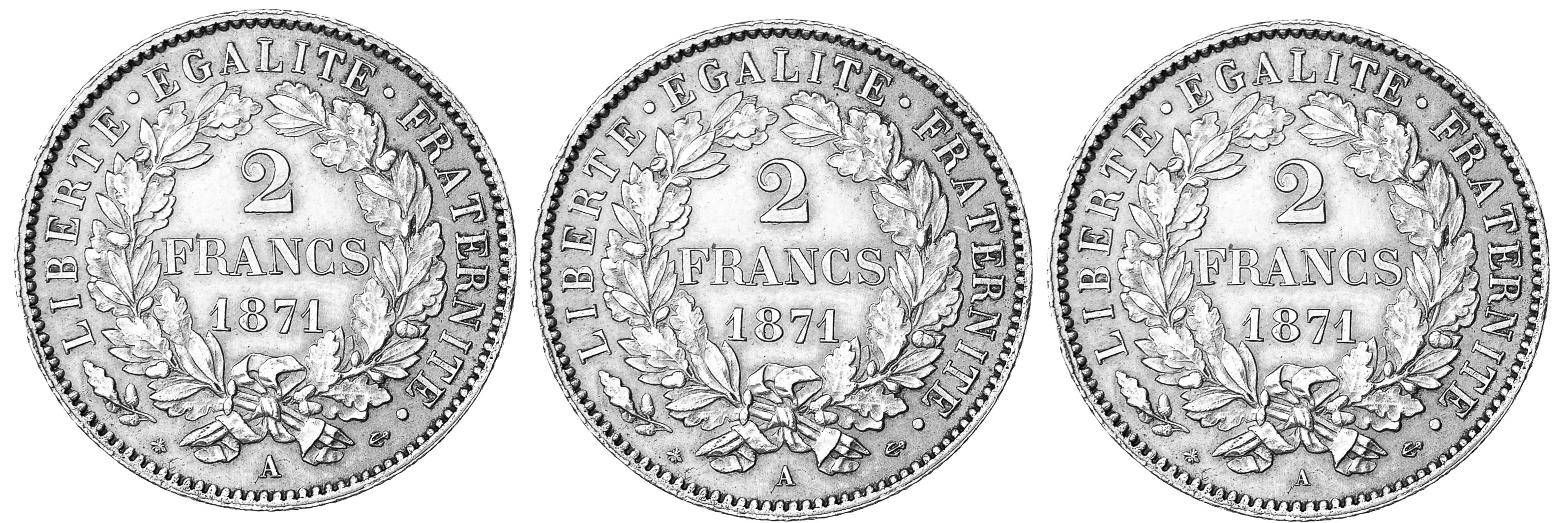
Illustration from a coin sold by Numiscorner, link to their website and sale: (I touched the light to see better):
https://www.numiscorner.com/products/coin-france-ceres-2-francs-1871-paris-au55-58-silver-km-817-1
5 francs
.jpg?1547140659089)
Illustration from a coin sold by Numiscorner, link to their website and sale:
https://www.numiscorner.com/products/france-hercule-5-francs-1875-paris-vf30-35-silver-km-820-1
.jpg?1547141768318)
After this board I think you can see more clearly, note finally, that the small letters are always same size thanof privy marks.